Designing an international “Venmo” on Solana rails
Designing a new money deposit and money transmission experience for the US/Mexican remittance corridor.
Background
In late 2023, I joined CoinFX's MoveMoney to improve a newly launched remittance app focused on the US/Mexican corridor. The audience was primarily seasonal migrant workers sending money to friends and family back in Mexico - many without American bank accounts, and most sending cash they had earned that week.
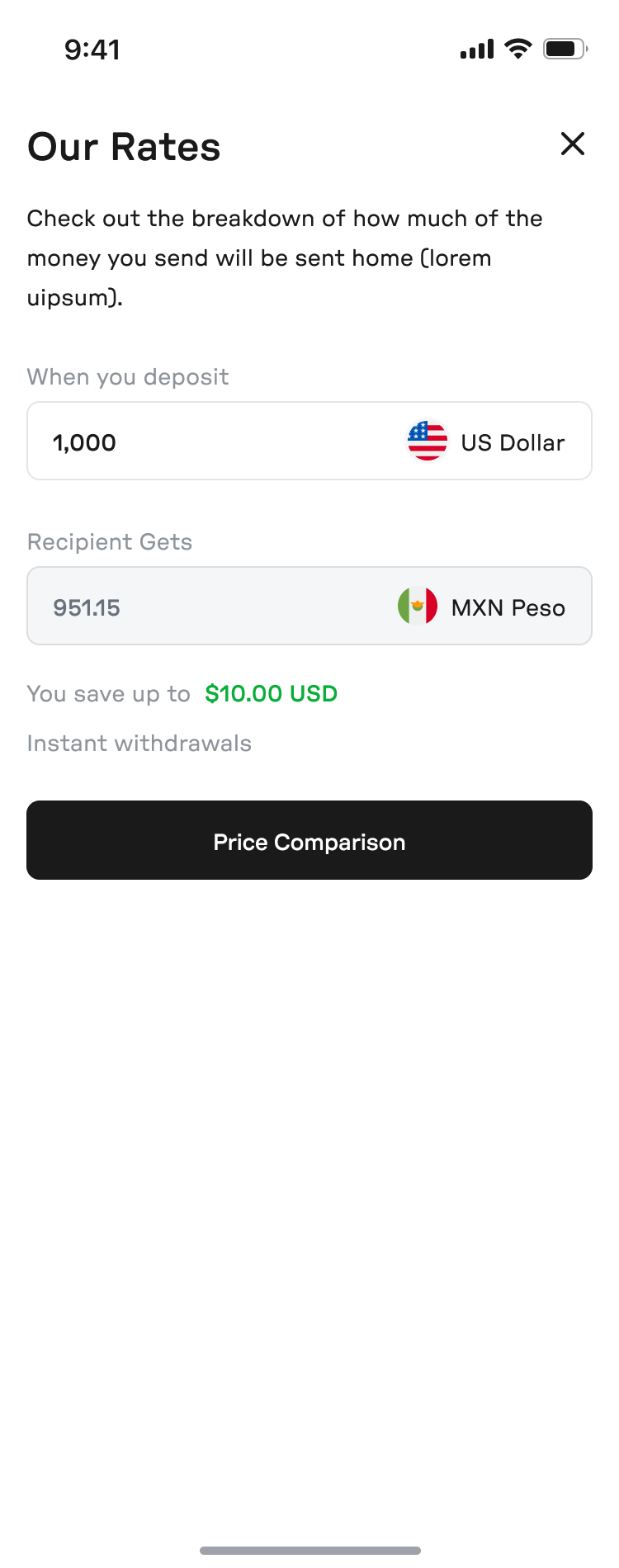
Under the hood, transfers moved as stablecoins on Solana, inside a licensed money-transmission and FDIC-insured structure. To the user, none of that was ever explicitly expressed. Partially to avoid over-explanation, and also because it simply wasn't necessary to understand how to use it. What was surfaced instead were the properties the blockchain rails made possible - no bank account, instant transfers AND instant settlement, with fees low enough to advertise against MoneyGram and Western Union (the MoveMoney platform was 95% cheaper on average). This application also enabled free cash deposits at over 80,000 retail locations - by way of using self-checkout kiosks as a sort-of reverse ATM users could make deposits at.
I was hired to take the lo-fi launched MVP and make it better while it was being used. It is easily the most chaotic engagement I have ever been a part of. It was also one of the most fun.
The business goals from leadership were unambiguous: increase cash deposits, increase transaction volume, and increase in-country withdrawals. Everything below maps to one of those three.
Depositing cash
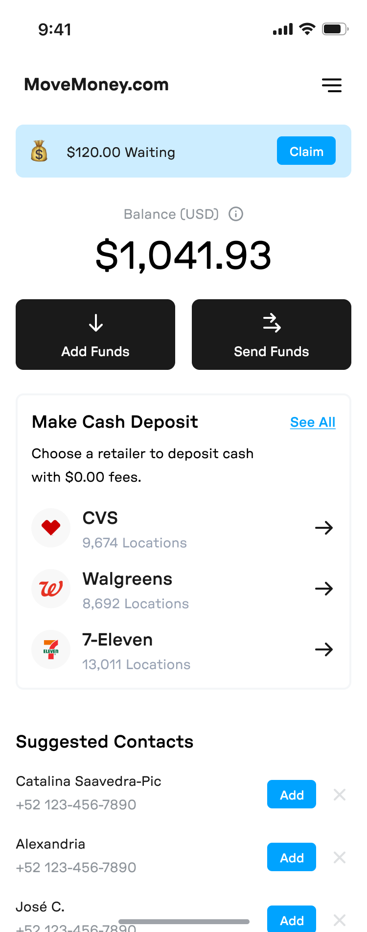
The cash deposit experience was one of the coolest features MoveMoney offered (imo) and it was also the user's primary entry point - migrant workers were often paid in cash and this application offered a convenient way to digitize their dollars at the participating retail locations, without fees. At launch, the MVP experience, demonstrated unfortunately well by high flow abandonment and high deposit failure rates, underwhelmed considerably.
To understand why, I did a few things.
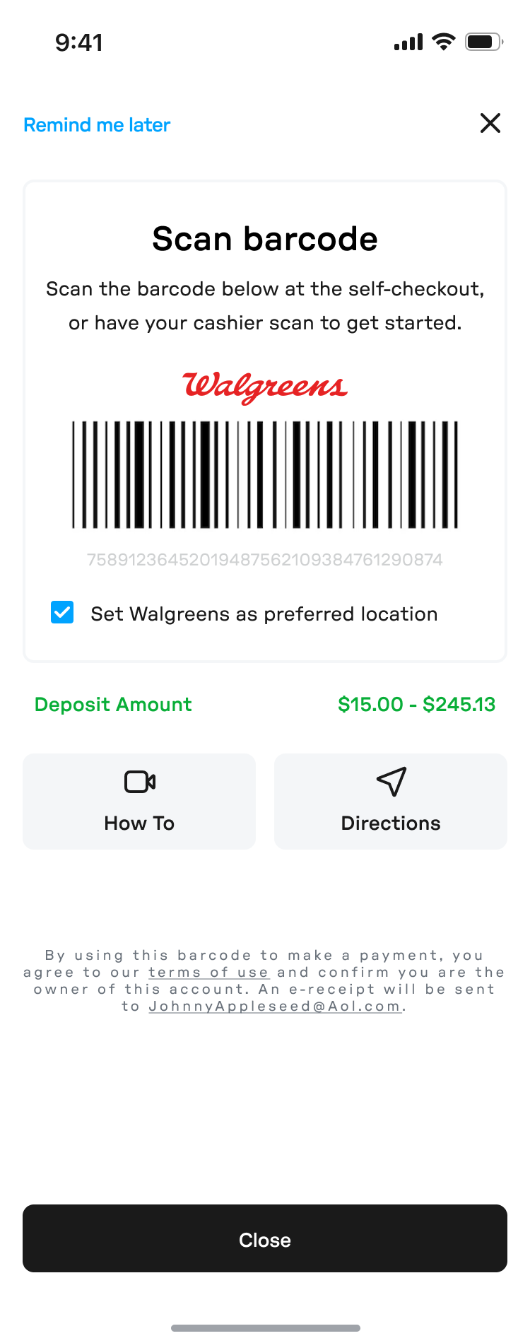
In PostHog, I watched session recordings and saw users reach the barcode creation screen and then stop. Alternatively, I noticed users would get to that screen, only to scan and fail for reasons that lived outside of our application's (or our user session monitoring tools') purview, at the self-checkout kiosks themselves.
I cold-emailed churned users that abandoned the app at key points in the user journey.
And I worked through our Mexican Ambassador - a member of the social groups in California where our early adopters lived - and used him as a proxy to guide conversations I could not credibly have myself.
The research surfaced three primary points of consideration.
- Intent began at home. Users were not abandoning flows in stores. Users were rather exploring the app at home or at work, trying to understand what the process would ask of them before actually committing to it. PostHog, rightfully, flagged these observations as user abandonment, but it was more akin to a user exploring the app and rehearsing novel features.
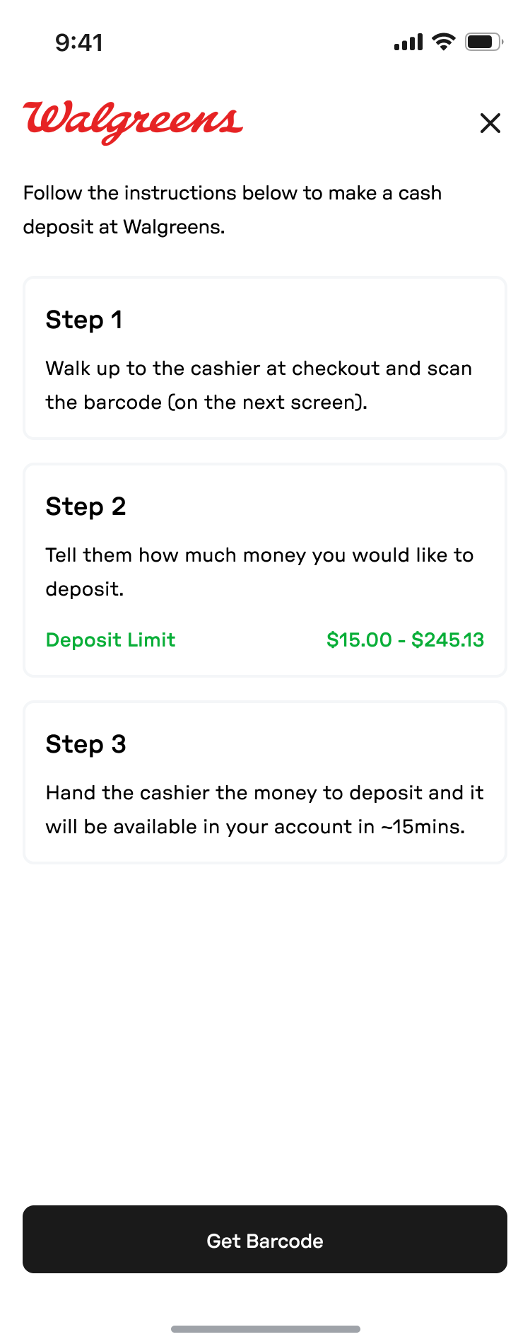
- The process, in its initially launched MVP state, was never fully explained. Users reached a barcode and a block of written instructions, and that was the entirety of the guidance.
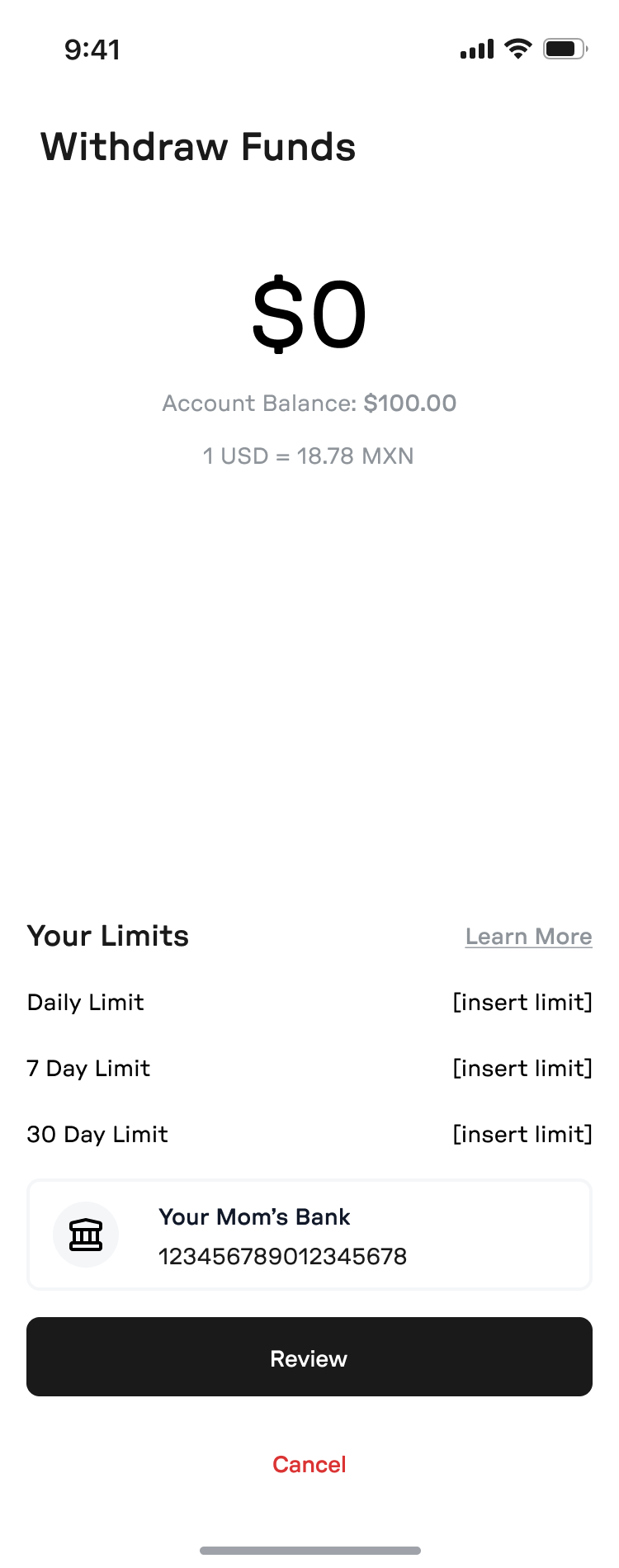
- The platform's minimum threshold limits were invisible. Users attempted small test transactions to build their own trust in the application, and our $20 minimum silently failed them, eroding any budding trust in the process.
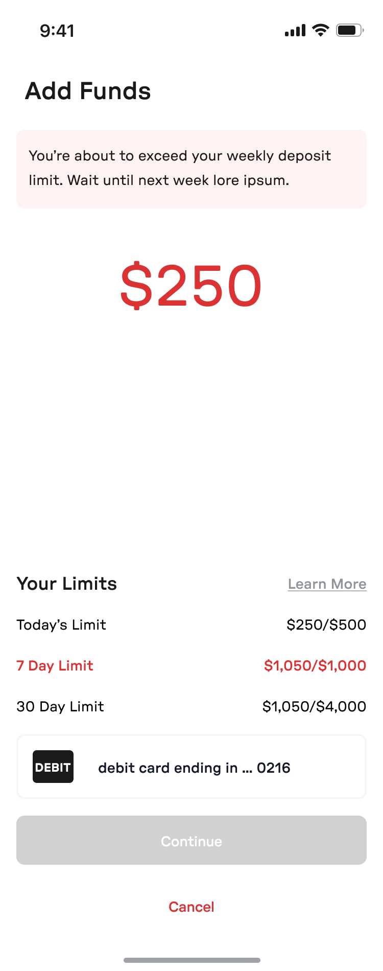
The changes were not dramatic, and (thankfully) they did not need to be: a visual instruction showing the deposit process end to end, an in-app map to nearby deposit locations, and deposit limits stated plainly on the barcode screen. We validated through ship and measure.
After implementing these changes, deposits rose and failures fell in the weeks that followed.
Claiming funds
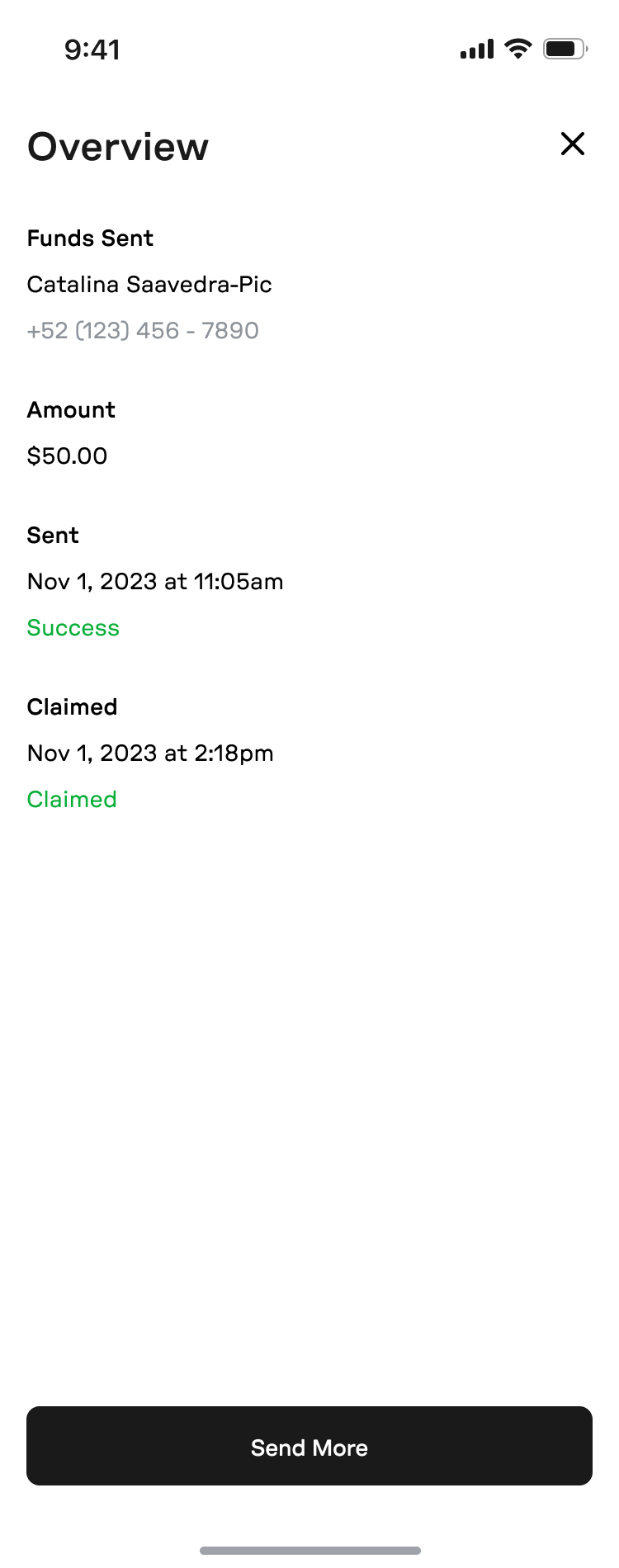
Receiving money was where the new rails diverged hardest from the incumbents. A recipient got a text message, clicked a link, created an account, and claimed their funds. This process is straightforward on paper but was a point of failure in practice, because an unprompted text saying “you have received money” reads as a scam. This led to a large amount of funds sitting unclaimed, and on the rare moments when they were in fact claimed, the lag between funds sent and funds received was enormous.
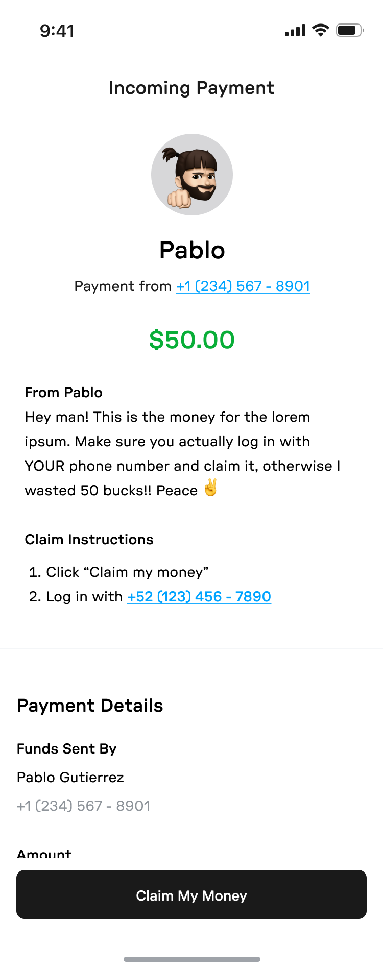
The redesign treated the claim flow as an exercise in expectation management:
- A payment overview screen that led with who sent the money and how much, not with our brand.
- A required personal message from the sender - forced friction, deliberately - so the claim text arrived carrying a voice the recipient recognized.
- The initial text CTA rewritten to include that message.
- Clear claim instructions, numbered, on one screen.
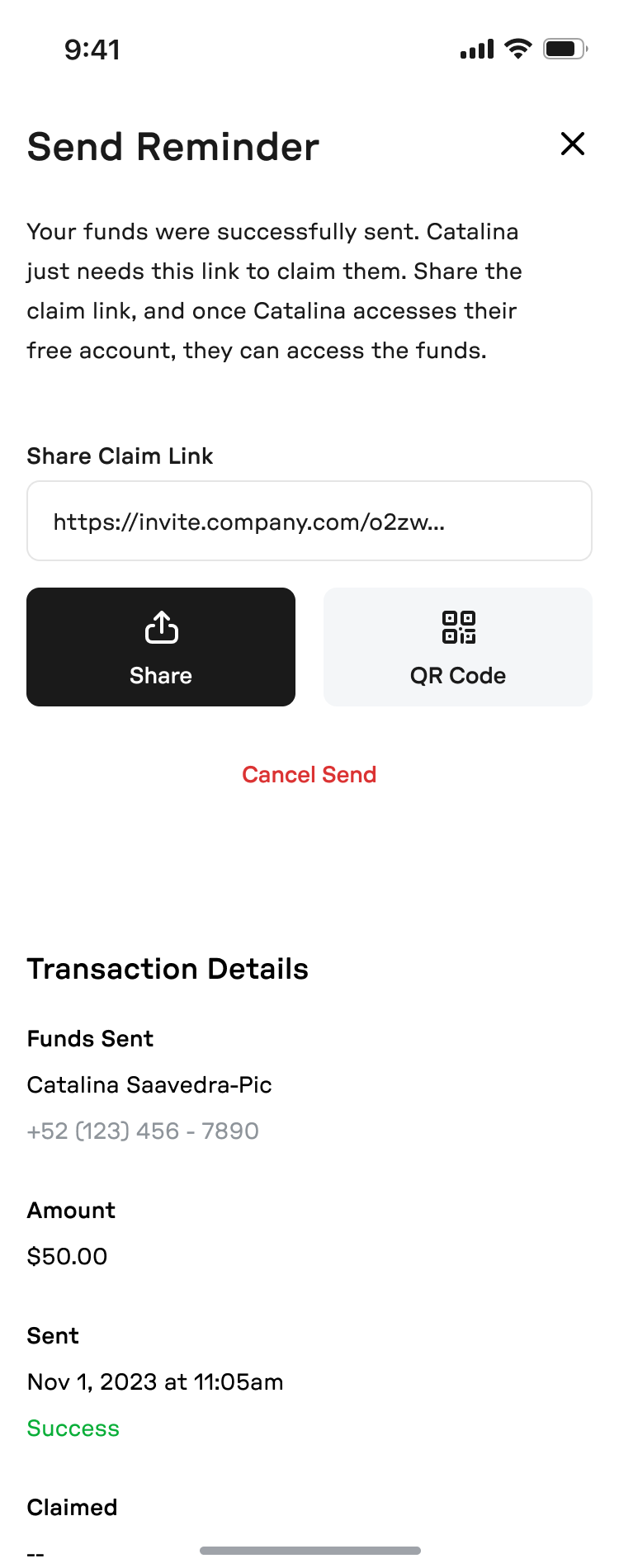
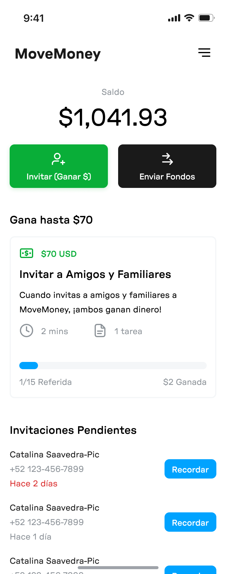
- Reminder CTAs on the sender's side, because the person with the strongest incentive to complete the loop is the one who just sent fifty dollars into it.
Gallery
What it left me with
Though undeniably valuable to those in need of a convenient way to send money cross-border, without an American bank account, and at low cost, MoveMoney struggled to attract meaningful market share in the remittance domain.
Novelty is not always a virtue, especially when you are sending money home. I found peace of mind to carry an overwhelming premium, and the entrance of many other stablecoin platforms, and incumbent international finance companies with far more in the way of reputation and marketing spend, crowded the market. MoveMoney suffered.
What the experience did do however, was prove the extent to which money movement is a trust problem, and trust is a function of expectation management. This is true in tradfi, but exceptionally true in the crypto space. Perhaps, people will eventually use crypto without knowing - which is what this application attempted to do - but at the time of writing, confusion simply leads to eroded trust between a user and an application.